Idealist Brand
Idealist is authentically joyful, showing that good work is sustained by creativity and play. Founded in 1995, we are a trustworthy and reliable guide in social impact, and we believe it's more than ok to have fun while building a better world.
We inspire action through storytelling, tips, and action, with clear language and clean design. Defining elements include pops of primary colors, playful illustration, and inspiring photography of real people.

On this page
Our Primary Logo
The Idealist logo is comprised of both a wordmark and a symbol. There is a primary logo (horizontal / side-by-side) and a secondary logo (vertical / stacked). Whenever possible, the wordmark “idealist” should appear on a white or light gray background. The logo may also be placed on a blue, or photographic background if needed. If this is the case, the wordmark should be white. Here are a few more guidelines.
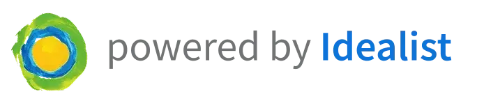
Idealist's Volunteer Solutions
For partners using one of our Volunteer Engagement Solutions, please use these logos:
- Volunteer Match, powered by Idealist
Color
Our brand colors are bright, playful, and reflect our mission. Blue is the primary color, while yellow and green play as prominent secondaries. Other brand colors are to be seldomly used, reserved for highlights or the rare pop of color. View our full color palette here.

Idealist Blue
Idealist Blue
#0D73D9

Idealist Yellow
Idealist Yellow
#F7C702

Idealist Green
Idealist Green
#68BD53
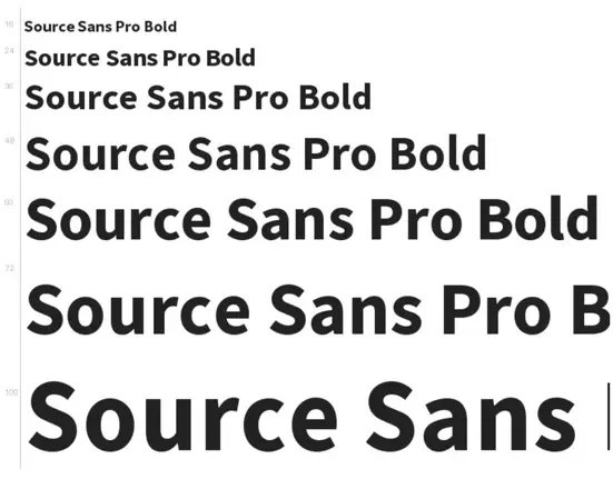
Typeface
Source Sans Pro, a straightforward sans serif typeface, is Idealist’s primary font. It is to be used across all mediums... web, print, video, presentations, etc. Any old typefaces are to be phased out.
Language
Tone
The way we talk about Idealist across our different products and channels should be consistent and evocative of our values and personality. Who are we? What is our goal? What is our mission / vision / purpose? Keep these in mind as we communicate with the outside world.
Language
Technical Standards
In addition to appearing professional by staying consistent in matters of punctuation, capitalization, voice, tone, use of grammar, etc., we believe that one way to show the world Idealist’s values and personality is by making specific, thoughtful word choices.


Language
UX Copy
While most of the copy we write is either marketing or blog-related content, sometimes copy is needed for a CTA, a basic headline, or other user-experience related tasks. This is UX copy. While this copy should follow suit with all other brand, technical, and tonal standards, UX copy must also be concise and deliberate. This doesn’t mean it can’t be playful or warm, but be careful not to use overly-flowery language. Efficiency is key. When designing buttons use Title Case, ex: "Start Here."

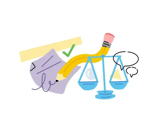
Illustrations
Illustrations and spots
Our illustration library reflects our key values and symbols. Bold brand colors, abstracted shapes, and symbols show the joy and playfulness of volunteering, good work, and community. Use this library in presentations, emails, or CMS pages. Please reach out to Marian for alternate sizes or custom graphics.
Photography
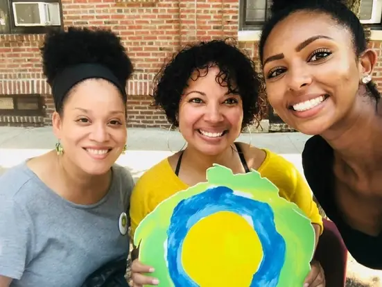
Whenever possible, use real photos of real people. Though the use of stock photography is inevitable, try to use images that show active people. Choose images that are bright, colorful, and diverse and reflect the breadth of activity on Idealist.
Out of Office and Email Signatures
Internal brand consistency strengthens the external brand. Through the use of styled Out of Office messages, unified email signatures, and consistent language, we will better reflect our mission. This section is staff only and requires site login.


CMS
Blog Posts
Blog posts should be visually appealing, consistent, and SEO optimized. This is achieved by utilizing standards created in our CMS. “Posts” are different from “pages” in that they are searchable from within a subsite, have a set publish date and author, and utilize a layout more conducive for longer sections of text. Please use this template as your guide for layout, formatting, and tags.
CMS
Landing & Marketing Pages
Whether you are creating a landing page for a mainstay staple of idealist.org, or a one-off marketing page for a new product or event, pages should be constructed with thought and structure. Pages are designed to be more scannable and digestible, with less text and larger areas for visuals. Pages are therefore more visually engaging and use a wider array of flexible content blocks than posts. “Narrow” pages are formatted more like posts and are not often used. Use the two links below to learn how to best standards when creating a page.